

A Word from the Rock Devotional
The Brief
Amazima Ministries is a nonprofit dedicated to empowering children and families in Uganda through education and community development. They needed a devotional that would deepen supporters’ spiritual connection while reflecting the heart and humanity of their mission. The piece was designed to serve as both a donor engagement tool and an ongoing ministry resource; something supporters would return to weekly. The devotional needed to feel warm, hopeful, authentically connected to Uganda, and elevated enough to feel gift-worthy without being extravagant or overly formal.
Creative Direction
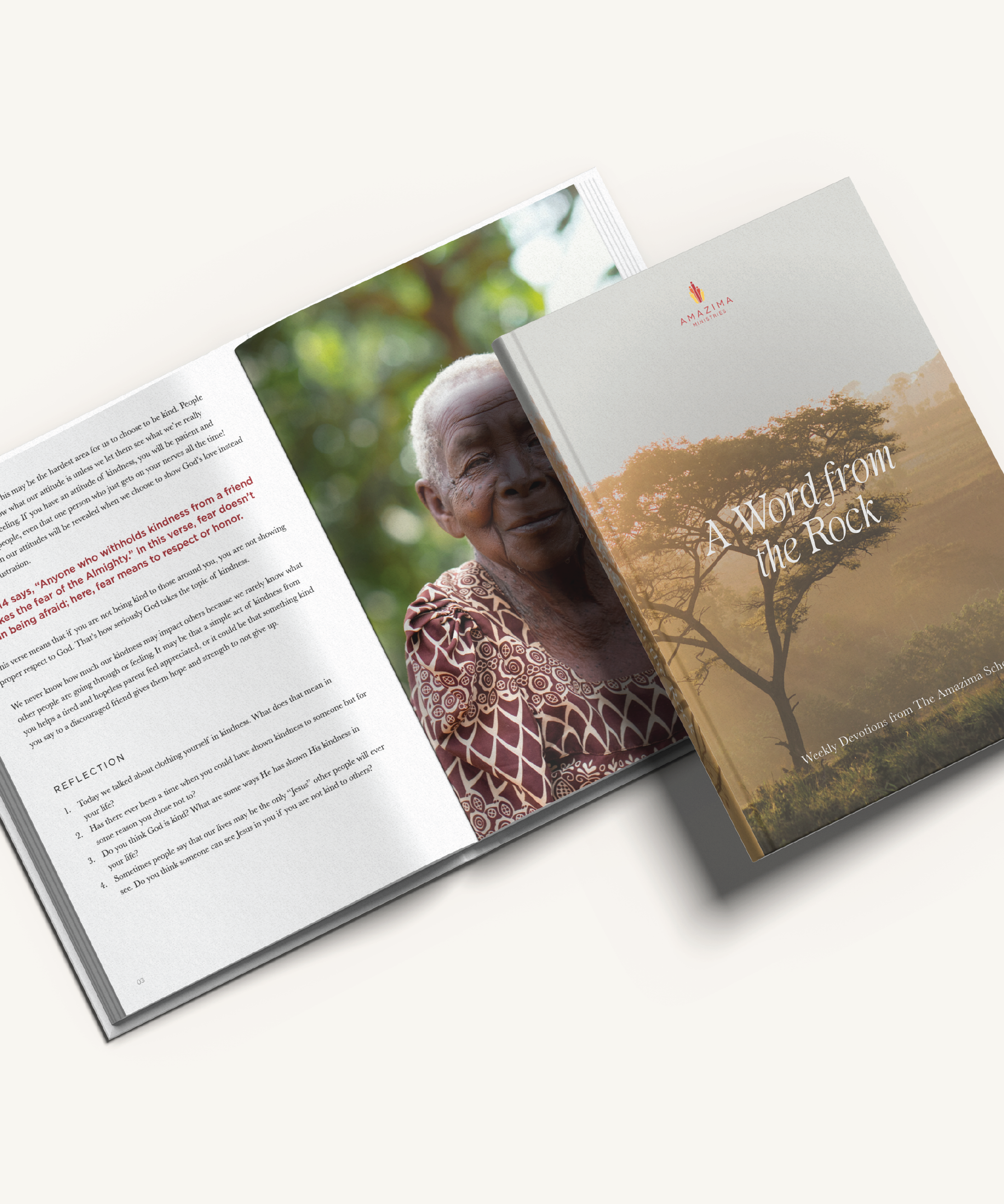
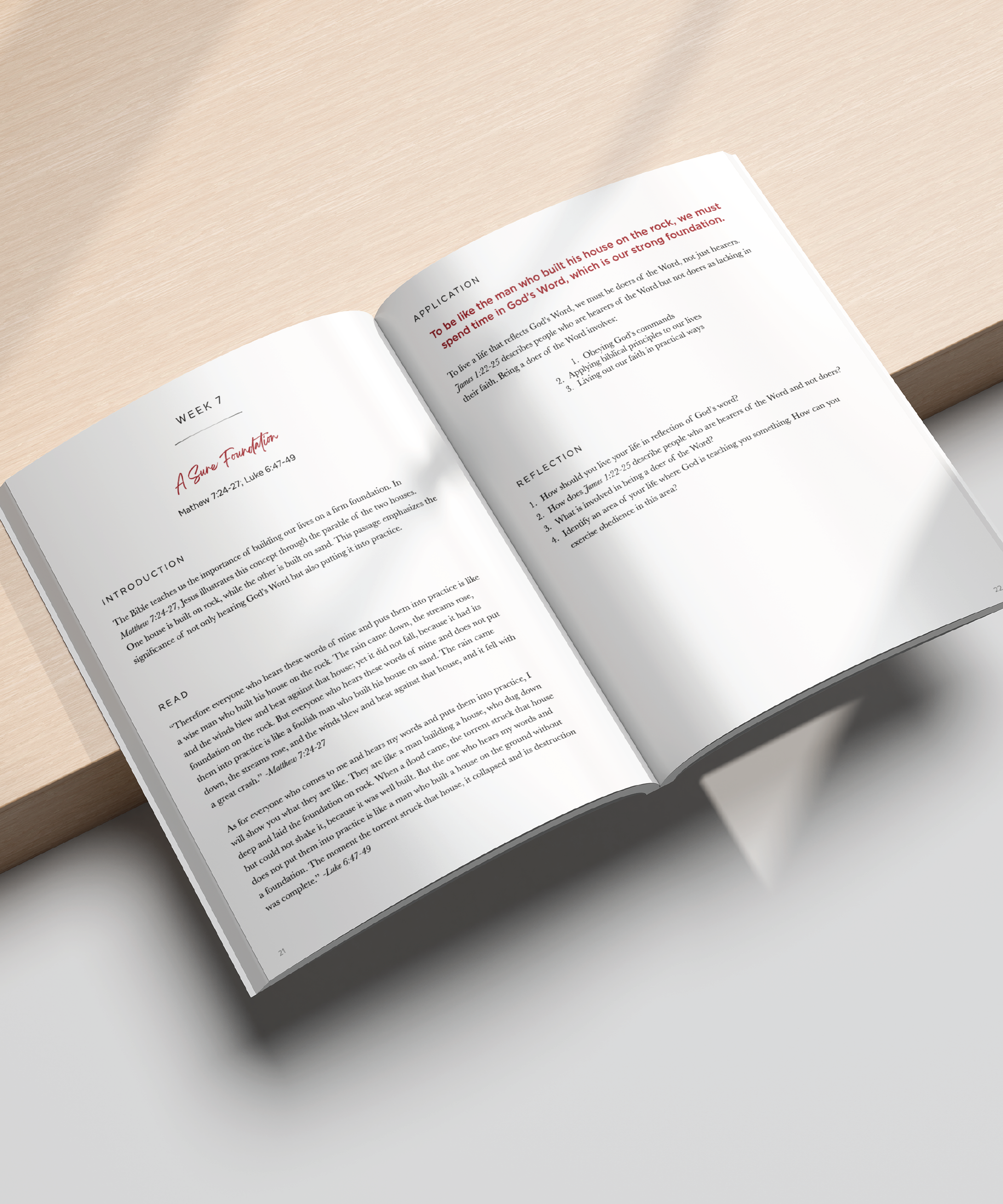
The creative direction centered on earth, light, and dignity, using warm, natural tones and intentional simplicity to reflect both faith and place. The cover features a lone tree silhouetted in golden light — a subtle metaphor for endurance and rootedness — paired with an elegant serif title for timelessness and clean, understated body typography for modern readability. Inside, full-bleed photography creates human connection, while generous white space allows the devotional content to breathe. A muted palette mirrors Uganda’s landscape, and structured reflection sections guide engagement. Guided by principles of emotional resonance, clarity, storytelling through imagery, and warm minimalism, the layout avoids clutter so narrative and photography work in quiet harmony.
Outcome
The final devotional strikes a balance between ministry resource and keepsake-quality publication, strengthening donor connection through thoughtful visual storytelling while elevating the perceived brand presence of Amazima. It establishes a cohesive visual language aligned with the organization’s mission and delivers a structured yet inviting devotional experience. The piece feels grounded and human — a reflection of both the spiritual foundation and the community heartbeat of Amazima.