King’s Baking Co.
The Brief
King’s Baking Co. approached Nothing Fancy Design Studio with a vision for a bakery brand that would feel whimsical, fresh, and completely unique to them as a couple. As avid food lovers with a creative spark, they wanted a visual identity that combined their playful personalities with deep cultural inspiration—drawing especially from Asian design influences and dreamy, ethereal aesthetics. Their goal was to create a bakery experience that felt magical, nostalgic, and joyfully distinct from anything else in the market.
Brand Concept
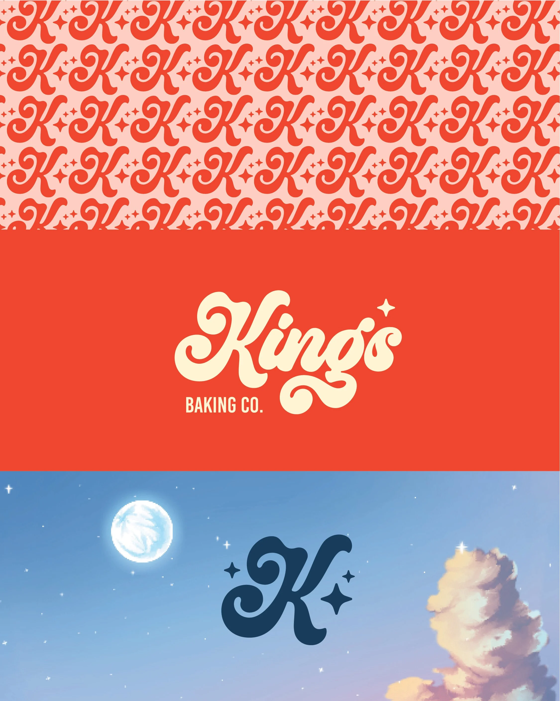
Inspired by both the visual language of vintage Asian packaging and the soft wonder of celestial themes, the identity for King’s Baking Co. blends boldness and whimsy. We explored a balance between magical and modern, with branding that could feel elevated but still super fun.
At the heart of the concept is the idea of baking as a love language—not just a product, but a feeling. That translated into a brand identity that’s cozy yet cosmic, vibrant yet intentional.
Outcome
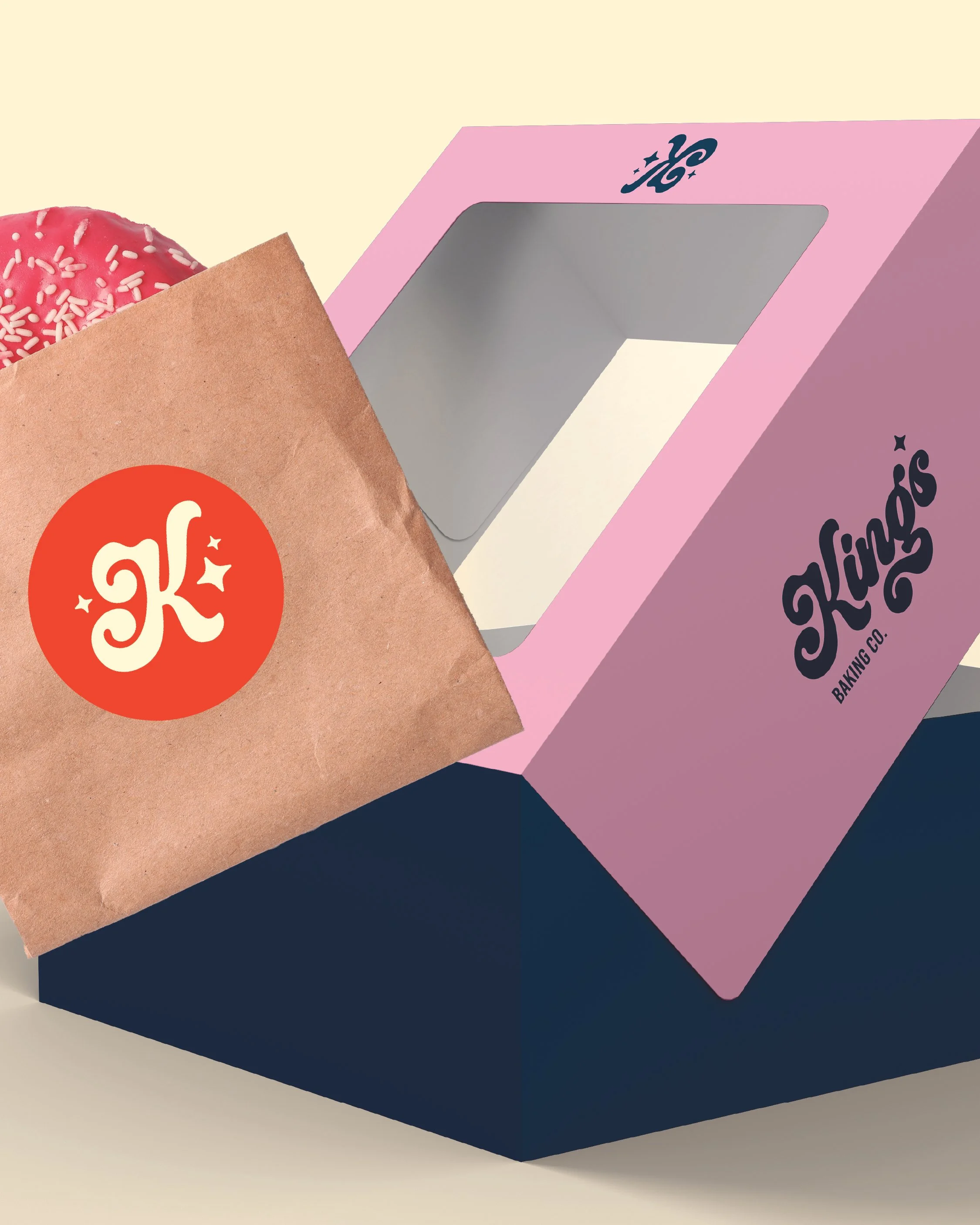
The final brand system for King’s Baking Co. delivers exactly what the clients envisioned: a playful, original identity that celebrates their love of food, their story, and their creative spirit. From the swirly logotype to the dreamy palette and packaging, every element was designed to reflect a business built on joy, creativity, and connection.


