

Graham’s Grounds
The Brief
Graham’s Grounds approached Nothing Fancy Design Studio looking for a warm, modern brand identity for their new coffee venture. They wanted something clean but full of personality—an identity that felt approachable, memorable, and flexible enough to live on packaging, signage, merchandise, and digital materials.
The goal was to create a look that expressed both craft and comfort while standing out from typical coffee shop aesthetics.
Brand Concept
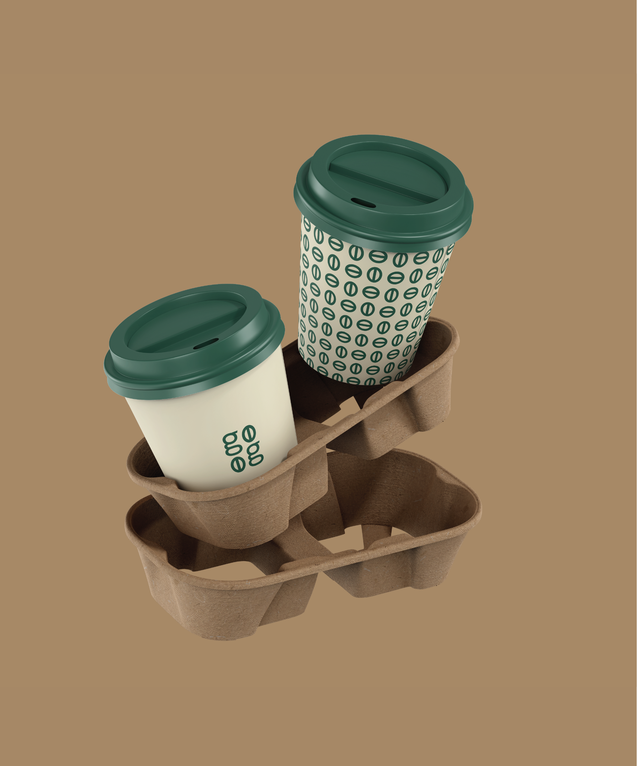
The concept centers around simple, consistent moments that bring comfort and energy to everyday life. The visual language leans into rounded, welcoming typography paired with a minimal, modern monogram. The “gg” symbol doubles as stylized coffee beans, creating an ownable mark that works beautifully at any scale.
A rich forest-green palette anchors the brand in warmth and sophistication, while the cream background adds balance and softness. A repeating bean-icon pattern expands the system, giving Graham’s Grounds a playful yet polished toolkit for packaging and branded materials.
The design direction reflects the brand’s core idea: grounded, intentional, and modern.

Outcome
The final identity system is clean, cohesive, and highly functional. The logotype and monogram offer multiple layout options, allowing Graham’s Grounds to adapt effortlessly across cups, labels, merch, and digital graphics. The coffee-bean pattern adds a recognizable signature element that reinforces the brand without overwhelming it.
Overall, the result is a modern, memorable brand presence that captures the feeling of a neighborhood favorite—warm, craft-minded, and unmistakably Graham’s Grounds.